
17 Nov 2026
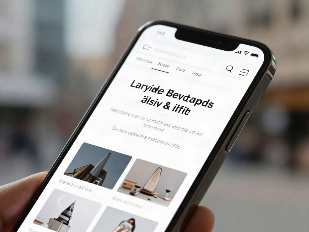
Mobile-First Approach: Why Your Website Has to Win Over Smartphone Users
In today’s digital landscape, it is essential that your website wins people over on a smartphone. The mobile-first approach is no longer just an option but an absolute necessity for the success of your online presence. The way people access the internet has changed dramatically. Mobile devices have become the primary tools for communication, information and transactions. A website that doesn’t work optimally on these devices not only loses potential customers but also damages its brand image and search engine rankings. At meisterkreativ.de, we understand this development and help companies adapt and implement their digital strategy accordingly.
The Mobile Revolution: Why Smartphones Dominate the Digital World
The dominance of smartphones in everyday digital life is undeniable. Whether for browsing, shopping, working or entertainment, the smartphone is our constant companion. This development has far-reaching consequences for companies and their digital strategy. More and more internet users access web content exclusively via mobile devices. This means that the first contact with your brand often takes place on a small screen. A poor mobile user experience can therefore be the first and last impression a potential customer gets of your company. Search engines such as Google recognised this trend long ago and prioritise mobile-friendly websites in their search results, making mobile SEO a decisive factor.
The Basics of the Mobile-First Approach: Thinking Mobile from the Start in Design and Development
The mobile-first approach means that a website’s design and development are first conceived for mobile devices before being adapted for larger screens. This is a paradigm shift compared with the traditional desktop-first approach. It is about designing the core functions and content so that they work optimally on a small screen. This requires a conscious focus on the essentials and a clear information hierarchy. Effective responsive design is the key to ensuring the website works seamlessly on every device and offers a consistent user experience.
- Content prioritisation: Which information matters most on a smartphone?
- Simple navigation: Clear menus and intuitive touchscreen controls.
- Fast loading times: Optimising images and code for mobile networks.
- Adaptive layout: Responsive design that adjusts to different screen sizes.
The Benefits of a Compelling Mobile Website: User Engagement and Higher Conversions
A website that wins people over on a smartphone offers numerous benefits. A positive mobile user experience leads to higher user engagement. Visitors stay longer on your site, interact more intensively with your content and are more likely to return. This has a direct effect on conversion rates. Whether it is a purchase, a newsletter sign-up or an enquiry, a smooth mobile experience reduces abandonment rates and increases the likelihood that visitors will complete the desired action. A modern, mobile-friendly website also signals professionalism and trustworthiness, which has a positive effect on brand perception.
Technical Aspects: Loading Times, Navigation and Usability on Mobile Devices
Technical details play a decisive role in the success of a mobile website. Loading times are a critical factor. Mobile users are impatient; a slow-loading page quickly leads to them leaving. Image optimisation, caching and efficient code structures are essential. Navigation must be intuitive and easy to use with a finger. Large buttons, enough space between interactive elements and clear menus are very important here. Readable text and correctly displayed forms also contribute to overall usability. A website that meets these requirements offers an excellent mobile user experience and contributes significantly to mobile optimisation.
The Mobile-First Approach as a Competitive Advantage: How to Stand Out
In an increasingly crowded digital market, the mobile-first approach is a decisive competitive advantage. Companies that consistently align their digital strategy with mobile users position themselves as forward-looking and customer-friendly. They benefit not only from better search engine rankings through mobile SEO but also from higher customer satisfaction and stronger brand loyalty. An optimised mobile presence lets you reach your target audience where they spend most of their time: on their smartphones. meisterkreativ.de helps you implement this strategy successfully and prepare your website for the mobile future.
Frequently Asked Questions
Here you will find answers to the most common questions about the mobile-first approach.
What exactly does mobile-first mean?
The mobile-first approach is a design and development strategy in which a website’s design and functionality are first conceived and built for mobile devices before being adapted for larger screens (desktop). It is about putting the mobile user experience at the centre.
Why is mobile-first so important for SEO?
Google and other search engines have used mobile-first indexing for years. This means the mobile version of your website is used primarily to evaluate your content and determine your ranking in search results. An optimised mobile website is therefore crucial for good mobile SEO and better rankings.
What role does responsive design play in the mobile-first approach?
Responsive design is a technical implementation of the mobile-first approach. It ensures that your website’s layout and content adapt flexibly to different screen sizes and device types. It is the technology that enables a consistent, positive user experience on every device.
How can I tell whether my website is mobile-friendly?
You can use various tools to check your website’s mobile-friendliness, such as Google’s Mobile-Friendly Test. Google Search Console also provides valuable insights into your site’s mobile performance and identifies potential problems.